1. There is already `gt-ac`, so no need to introduce `flex-item-center`
2. The `flex-item-baseline` and `.flex-item-icon svg { margin-top: 1px
}` seem to be a tricky patch, they don't resolve the root problem, and
still cause misalignment in some cases.
* The root problem is: the "icon" needs to align with the sibling
"title"
* So, make the "icon" and the "title" both have the same height
3. `flex-text-inline` could only be used if the element is really
"inline", otherwise its `vertical-align` would make the box size change.
In most cases, `flex-text-block` is good enough.

---------
Co-authored-by: silverwind <me@silverwind.io>
Co-authored-by: Giteabot <teabot@gitea.io>
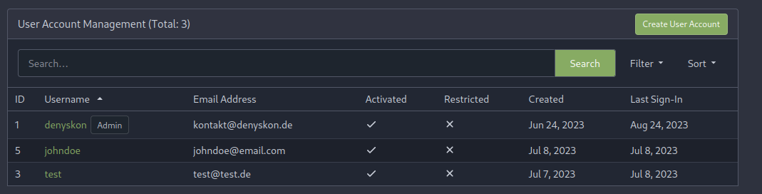
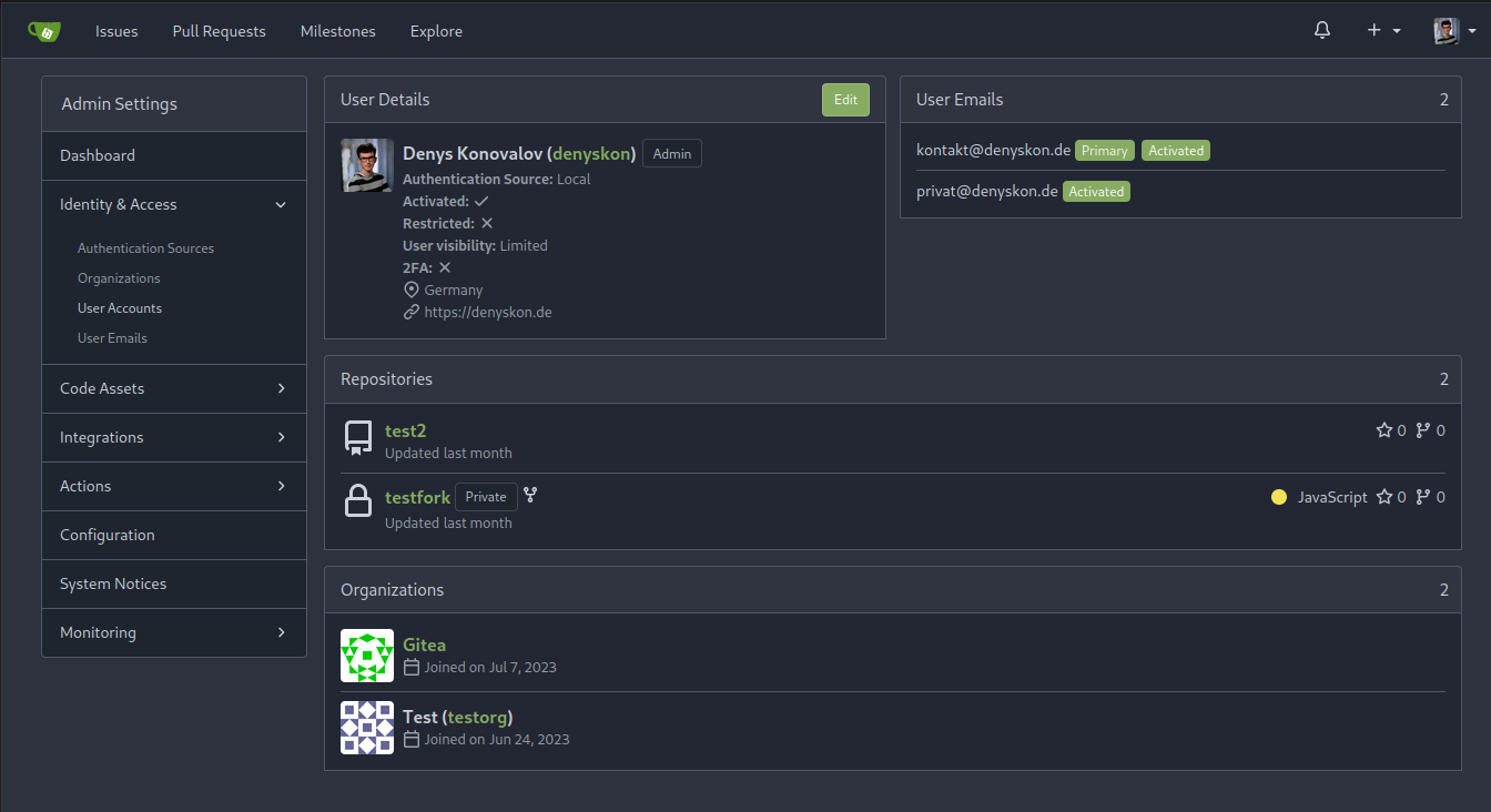
This PR implements a proposal to clean up the admin users table by
moving some information out to a separate user details page (which also
displays some additional information).
Other changes:
- move edit user page from `/admin/users/{id}` to
`/admin/users/{id}/edit` -> `/admin/users/{id}` now shows the user
details page
- show if user is instance administrator as a label instead of a
separate column
- separate explore users template into a page- and a shared one, to make
it possible to use it on the user details page
- fix issue where there was no margin between alert message and
following content on admin pages
<details>
<summary>Screenshots</summary>
</details>
Partially resolves#25939
---------
Co-authored-by: Giteabot <teabot@gitea.io>